The question of what makes a good photo is a very frequent one, and a very old one, and as far as I am concerned there is no clear answer.
Yes, we have many ways of “objectively” evaluating an image. Is it framed correctly? Are the rules of composition being applied correctly? Is it exposed properly? Is the subject lit properly? Does the colour scheme work well? Is there an overall harmony in the image? Does it appeal to the viewer? That last question, as well as that sneaky word in the first line of this paragraph, “objective”, are what make us fall short of concretely being able to determine whether an image is good or not. In my opinion, that is.
As mentioned, there are some guidelines (often called rules) that help us shape how our images should look. I was taught quite extensively during my photography studies about the rule of thirds, leading lines, filling the frame, the golden ratio, repetitive patterns, etc, etc. The thing is that all of these rules are still nothing more than suggestions to help the budding photographer find her way and shape her image. Are they rock solid in their ability to make an image universally appealing? Hell no! Are they methods that aid us in approximating something that finds broad appeal? 100%!
It must be said, at this point, that I am approaching this as a photographer whose profession it is to create images that will appeal to his clients and fulfil the need they have. This means that there are many more factors that creep into the equation, other than simply “is it a pretty photo”? There are considerations such as the client’s expectation, the time they are willing to give you for the creation of these images, the budget that have available, and what they expect to happen for this budget. That would mean in a commercial space, given all these factors, the question of something being a good photo might be a very different one than purely looking at an image and deciding whether you like it or not.
Let’s get back to the topic. Pure and simple, what makes for a good photo? I’ve mentioned a bunch of criteria, which we are always taught help us make a good photograph, but are those criteria enough, and do they indeed help make for the best photos? Perhaps another way we should ask this is not what makes a good photo, but who? Is it the people who buy and sell art at levels at which the rest of us can only dream? Are they the ones who determine what our collective imaginations believe to be good imagery? If so, then perhaps we can look toward some of the most expensive photos ever sold to see if these are “the best”.
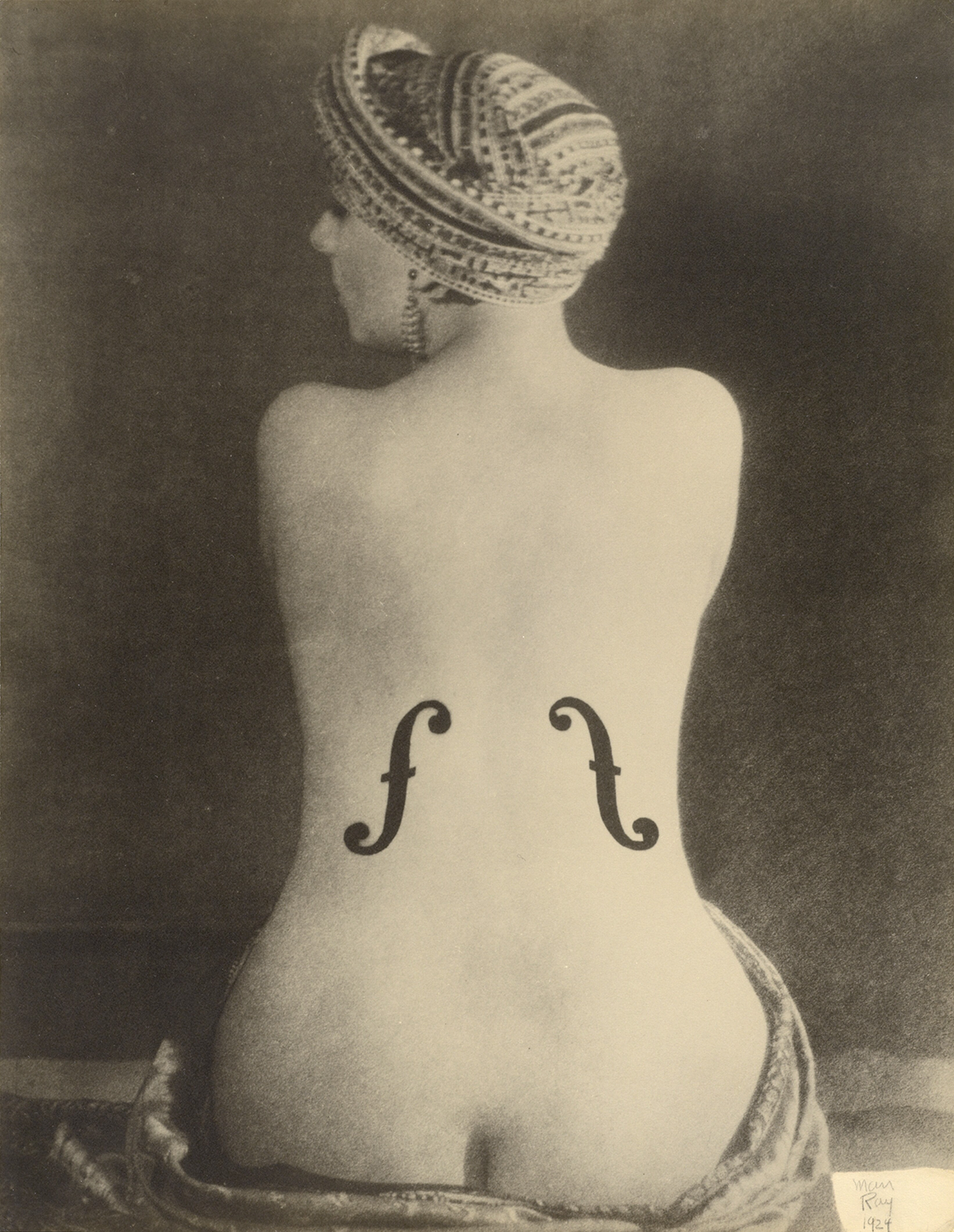
Le Violon d'Ingres - Man Ray
The single most expensive photo ever sold? Man Ray’s “Le Violon d’Ingres”. The price? $12,400,000. The best photo ever? I would be pretty certain in saying “nope", but would be perfectly happy to leave it up to the viewer. The technical execution of this photo is fairly standard, even for its time. It was not breakthrough in any way other than perhaps conceptual. That is to say that most proficient photographers of that era could have easily executed this photo. Is it then the conceptual element that helped to send this photograph's price into the stratosphere almost 100 years later? Who knows.
The second most expensive photo ever? “The Flatiron” by Edward Steichen. The price: $11,800,000. Is it the best ever? You decide:
The Flatiron - Edward Steichen
I really like this photo. The mood, the lighting, the colours, they all speak to me. Would I call this the “best photo ever”? Absolutely not. And for that price, it should be a hell of a lot better. That would leave us again with that question of what would make it “better”. You see where this is going.
Let’s take a look at one more. This is a photo that I assume a lot of people are actually a bit familiar with, because it caused quite a stir when it sold for $4,338,500 in 2011. I remember somewhat “losing my shit” when I saw the photo, and how much it sold for. It absolutely boggled my mind that an image this simple, this easy, and this mundane could sell for such an exorbitant amount. It actually did a good job in convincing me that the idea of art was total and utter bullshit. My views on that have changed since, but I’ll not get into that now.
Either way, I give you Andreas Gursky’s “Rhein II”:
Rhein II - Andreas Gursky
As I’m sure you may have deduced from my writings above, I would give this photo a long, drawn out “heeeeeeeelllll no” to the question of is it the best. So, this shows me that money spent on buying the artworks doesn’t determine how good or bad they are, so what other metric could we look at? How famous, or well known an image is, might be a good indicator. Surely only good, or even great, perhaps only the best, photos would become world-famous and speak across generations…? I am more than happy to admit that there may be elements to the “artier” side of photography that I just don’t get, and therefore don’t see the relevance of these photos to our society. And maybe that makes them less impactful to me. So let’s look at some famous photos and see where that takes us.
Widely regarded as one of the most famous photos ever is Steve McCurry’s “Afghan Girl”. Fame is a bit more wishy-washy than price, so it’s a little harder to pin down “the most famous ever”, but I think most photographers would put this up there as being in the running for that title.
Afghan Girl - Steve McCurry
Is it good? Absolutely! Is it the best? Meh, I’m not so sure. It’s very definitely a great photo that carries a lot of weight, and is for sure a wonderful portrait of a striking girl, but I would struggle to hand it the title of best ever. It certainly had an impact in that it helped bring home, to many people in the western world, the humanity of the Soviet-Afghan war. The photo carried a weight beyond itself as a good photograph. Is that the metric we should be using to judge a “good” photo?
Another one of the most iconic images is the photograph aptly known as “Tank Man” or “Unknown Protestor”, taken by Jeff Widener. It's the image we all know of the unknown man standing in front of a column of tanks near Tiananmen Square in Beijing, China. Is it iconic? Absolutely. Did it have a huge impact on the world at the time of publishing? Absolutely. The photo had such an impact, that it is still banned in China today, and subject to extreme censorship. It must be said that this probably has more to do with China’s censorship rules than the actual photo itself, but nevertheless the photo carries a lot of weight. The photo simply shows the Chinese government doing something that it doesn’t want the world to see. And that is probably where this image’s power lies.
Does that make it a good photo? Perhaps, yes. Who am I to say.
Tank Man (uncropped) - Jeff Widener
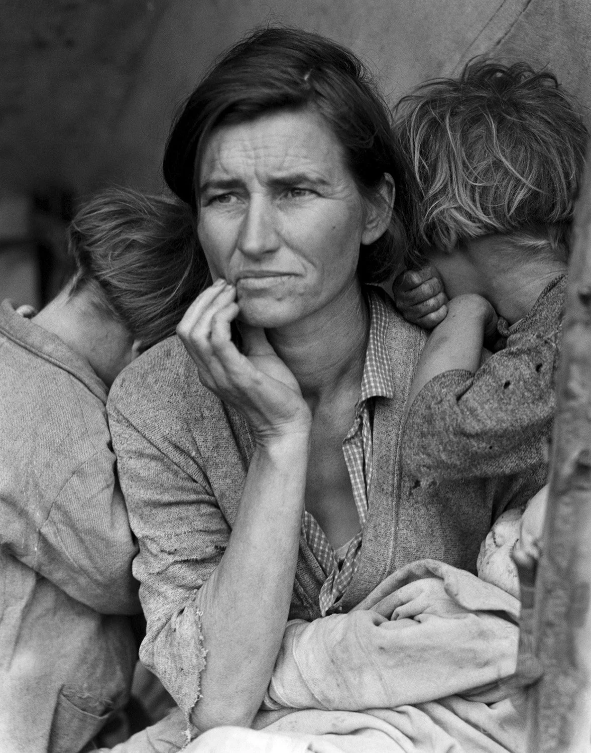
Another image featuring a woman, whose image helped humanise a crisis, is the image titled “Migrant Mother”, photographed by Dorothea Lange in 1936. This time the crisis was the Great Depression, and the image helped bring home the struggle of the individuals fighting their way through the hardship. An iconic photo, for sure, but is it a “good photo”? There are a couple of things about this photo that absolutely don’t follow the classic rules and guidelines of what makes a good photo. The biggest and most glaring “issue” I see with this photograph is the lack of sharpness in the subject’s eyes. If there was an overall lack of focus, I could look past it, but there is a clear line of focus, but it is in the wrong place. This was something I was taught is an absolute no-no, unless done for outright artistic purposes, which clearly is not the case here. But does that take away this image’s title of “good photo”? Definitely not.
Migrant Mother - Dorothea Lange
Perhaps it is the technical difficulty that is required to execute an image that gives it the moniker of “good”. Maybe it’s removing the ability for “anyone” to have taken the photo that would somehow elevate it to the next level? Let’s look at two examples of technically difficult or challenging photos, and see whether that might be the thing that sways us.
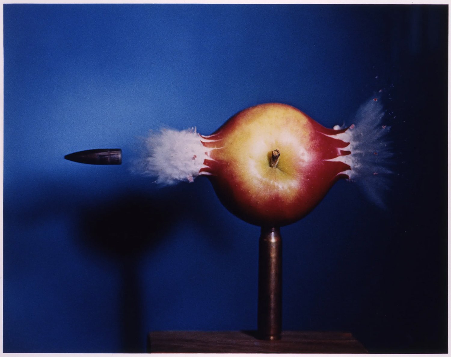
First up we have Harold E. Edgerton’s “Bullet Through Apple”.
Bullet Through Apple - Harold E. Edgerton
The title of this image tells us exactly what to expect. A bullet going through an apple. This image is perhaps no longer the technical marvel it once was, due to the rapid advancement of technology and high speed cameras. In its day, however, this photograph was absolutely revered for what was breakthrough science at the time. By using electronic relays and microphones, Edgerton managed to freeze a bullet in time, shortly after coming out the other side of an apple. It’s an incredible feat. Is it a good photo? Visually, aesthetically, perhaps it’s not the greatest, but technically it’s insane. Good? Yes? Still subjective? For sure.
The last photo we’re going to look at is my favourite photo in this entire post, although not because of the photo, but what was said about it afterwards. The “Pale Blue Dot” is a terribly low resolution, grainy, noisy image taken by the Voyager 1 Spacecraft at a distance of about 6 billion kilometres from earth. Yes, 6 billion, with a “B”.
Pale Blue Dot - NASA
If I’m honest, the photo itself looks a little like it was photographed with a potato. It looks like a mistake, or that the camera malfunctioned. So, as a photo, it’s not particularly arresting. That is, not until you realise that the little white spec on the right, just about a single pixel in size, is actually planet Earth, caught in a ray of sunlight. That little white spec is the “Pale Blue Dot”. As said, to me, it’s not the image in an of itself that makes it great, but rather what the image represented, and also what was said about it afterwards by Carl Sagan. The speech he gave on the Pale Blue Dot is, without a doubt, one of the greatest speeches ever made. Watch it here. Really, do yourself a favour and watch it. So, once again, the same question. Is it a good photo? I took a space agency years of development, billions of dollars in funding and 6 billion kilometres distance to make this image, yet I would still say that as a photo it’s not all that good. But what it represents is incredible.
So, where does that leave us? What really are the criteria by which we get to decide whether a photo is a good one or a bad one? Have I found and given you a clear definition of what makes a good photo? Most certainly not. If not, then what was the point of all of this rambling? I do not have a good answer for you.
I guess the definition of what a good photograph is can be quite succinctly summed up in the old adage, “Beauty is in the eye of the beholder”. More than that, I cannot give you. I’d like to think that there is someone out there who could give you a clearer answer as to what makes a good photo. What if you did find such a person, and they gave you all the explanations in the world of what makes and doesn’t make a good photo.? What if they then showed you an image that was deemed by a panel of experts as being “the best photograph ever made”, but you didn’t like it? Where would that leave you? I’m afraid to say, it would probably leave you in no clearer place than where you were before you read this blog post. That is to say, with no good definition of what makes a photo good or bad other than quite simply: Do you like it?


